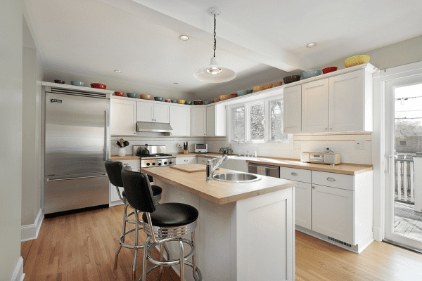
 Does your kitchen draw a crowd or crowd you in? Here’s how to make sure your compact kitchen leaves room to breathe.
I’d be willing to bet that when you think about your dream kitchen, it doesn’t include the word “tiny.” Yet that’s the reality that many of us live with: skimpy counter space, a cramped work triangle and precious little space for appliances. If you’re not ready — or willing — to knock out a kitchen wall, you can at least do the next best thing: Create the impression of a bigger space with a few strategic decorating tricks.
1. Replace solid cabinet doors with glass ones. Glass fronts lighten the look of cabinetry and allow the eye to travel through to the back, which helps the kitchen seem more expansive. Just don’t clutter the interiors with bric-a-brac — you’ll defeat the purpose.
2. Paint cabinets the same color as the walls. Limiting th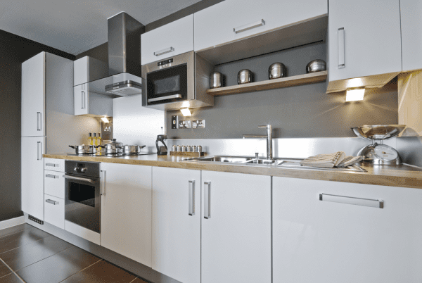 e cabinetry and the wall color to a single hue erases visual boundaries that might stop the eye. The conventional school of thought is that pale colors will reflect light and make the space feel bigger, and that’s certainly a safe approach. But don’t be afraid to go dark, either. Deep tones such as black, navy, charcoal and chocolate recede visually and create the impression that the walls are farther back than they really are.
3. Choose furnishings with a small footprint. Select petite islands, slim chairs, streamlined stools and narrow tables that don’t eat up valuable floor space. Avoid chunky furniture legs or thick bases, which add visual bulk.
4. Recess storage. Tuck a pantry, shelving or cabinets flush with the wall to keep from obstructing the kitchen’s flow. It’s fairly easy to retrofit a recessed niche, especially if you orient it between wall studs.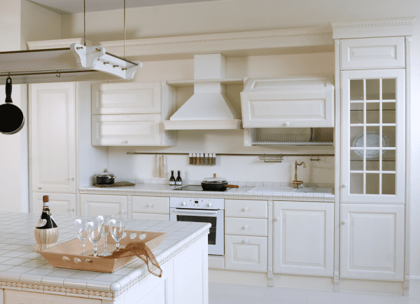
5. Design with clean lines. Big corbels, ornate cabinetry and fussy details can make a kitchen feel chopped up. Instead, keep the elements tailored and sleek to smooth out the look and create a roomier feel.
6. Merge into a larger space. This breakfast room, separated from the kitchen by a low half wall, feels like a natural extension of the cooking area.
7. Incorporate open shelving. Open shelves reduce visual weight and lend the illusion of a more expansive space. For an even sleeker look, choose floating shelves over models with brackets.
8. Winnow down. Don’t crowd counters, shelves and cabinets with clutter, which makes the space look as though it’s bursting at the seams. Instead, focus on a few standout items and necessities and hide the rest away. 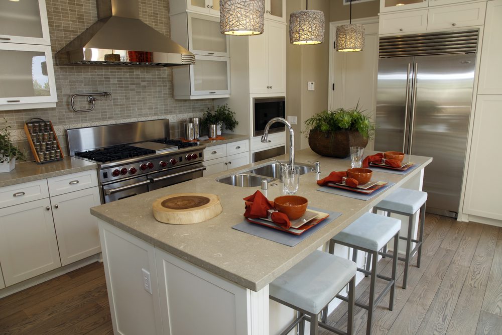
9. Direct the eye upward. Choose patterns and visual elements that help to guide the gaze toward the ceiling. The vertical lines of the wall and ceiling boards in this kitchen lend the impression of greater height.
10. Flood the space with light. Whether your kitchen is done in pale colors or dark ones, light beaming in will help it feel as large as possible. Keep window treatments very simple, or eliminate them entirely, so as not to block the sun.
As a Design+Build General Contractor, I offer my clients a one-stop shopping approach to all of their home remodeling projects. I work with my clients from initial conception of a project through its completion. Every aspect of the job is managed by me and my professional crew. You will be included in every step of the design process until the final drawings are completed. No detail is left to chance. General Contractor Specializing in Kitchen & Bathroom Design and Remodeling Throughout the Los Angeles area.
Written By:

Offer Steuer
President
OTM Designs & Remodeling, Inc.
For more information you may contact us via email at service@otm1designs.com or you may call us at 888-981-1415. Our website is www.otm1designs.com.


